Debunking the OWID Chart on COVID-19 Death Rate by Vaccination Status
A detailed analysis shows that the efficacy claims are based on a highly questionable data foundation.
Summary
There are several source data problems, such as missing/hidden data and or incomplete sources.
Massive difference in rates between countries point towards underlying methodological issues.
Only four countries provide data, for an often short time frame, which does not allow for proper analysis.
Partially vaccinated and unknown are omitted by OWID.
Rates are based on COVID-19 deaths, which are likely based on unreliable classifications, uncontrolled testing methodology and different populations. Actual deaths figures reveal that unvaccinated are not dying at large.
Manipulative coloring tries to manipulate the reader.
Possible misclassifications might skew results.
Less than 50% of excess deaths are accounted for by these COVID-19 deaths.
Background
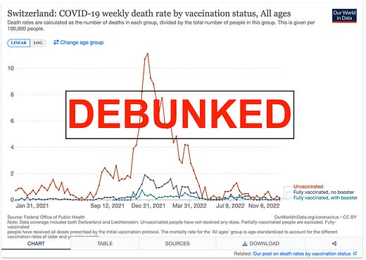
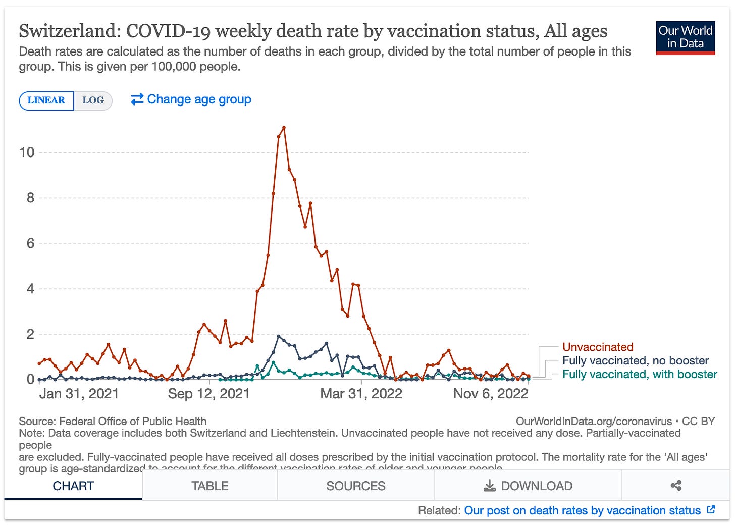
This ‘Our World in Data’ (OWID) chart on COVID-19 weekly death rate by vaccination status is often shared and used by vaccine fanatics as ultimate proof that the vaccines work and are saving lives. In this article, I take a very close look at the ‘science’ behind it and dissect how this chart is generated, and the problems that I have identified.
1. Issues with Sources
Switzerland
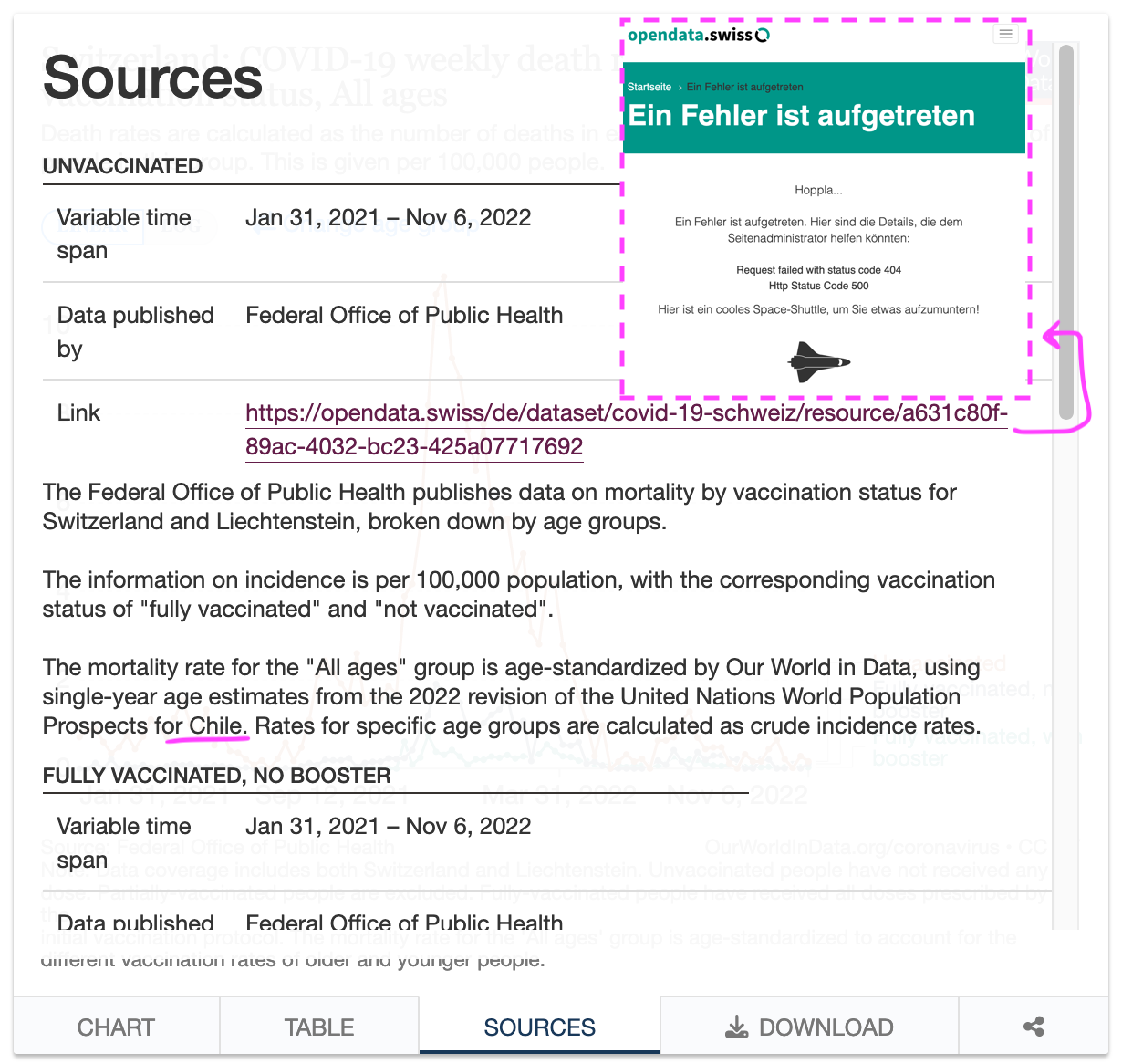
The link, that they provide for the underlying data, leads to a Swiss page, that shows a 404/not found error. The description mentions, that they use population data from Chile for the rate calculations. This is likely a copy/paste error.
I did find the missing link in the Web Archive, and was able to download the CSV. However, the linked dataset, only has data up to week 2022 W19 while OWID shows data until Nov 6 2022 (2022 W45). It is unclear where the missing data for week 20-45 is sourced from.
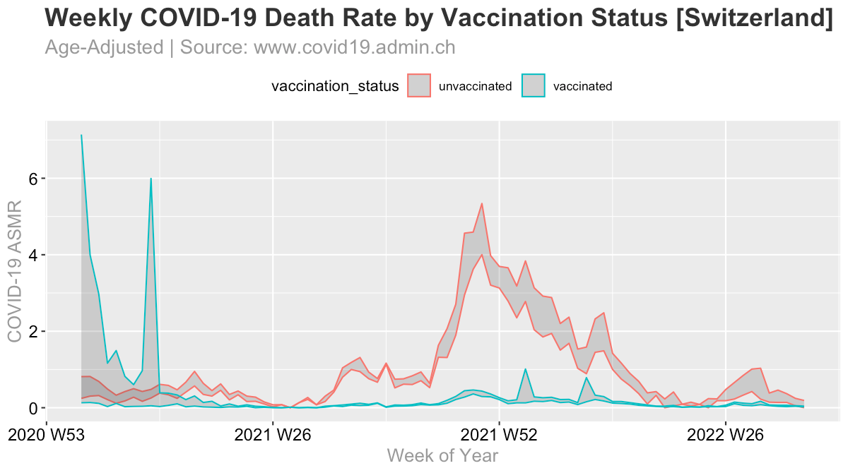
Besides the missing data, I was able to recreate almsot the exact charts, including the age-adjustment used. I did not use population data for Chile, but the ESP2013 standard population.
To see why this chart is problematic & misleading, please read on …
United States
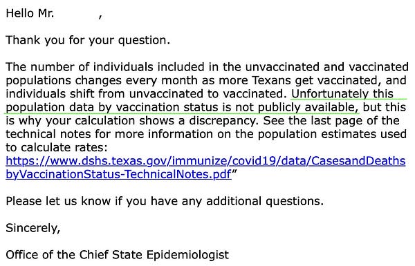
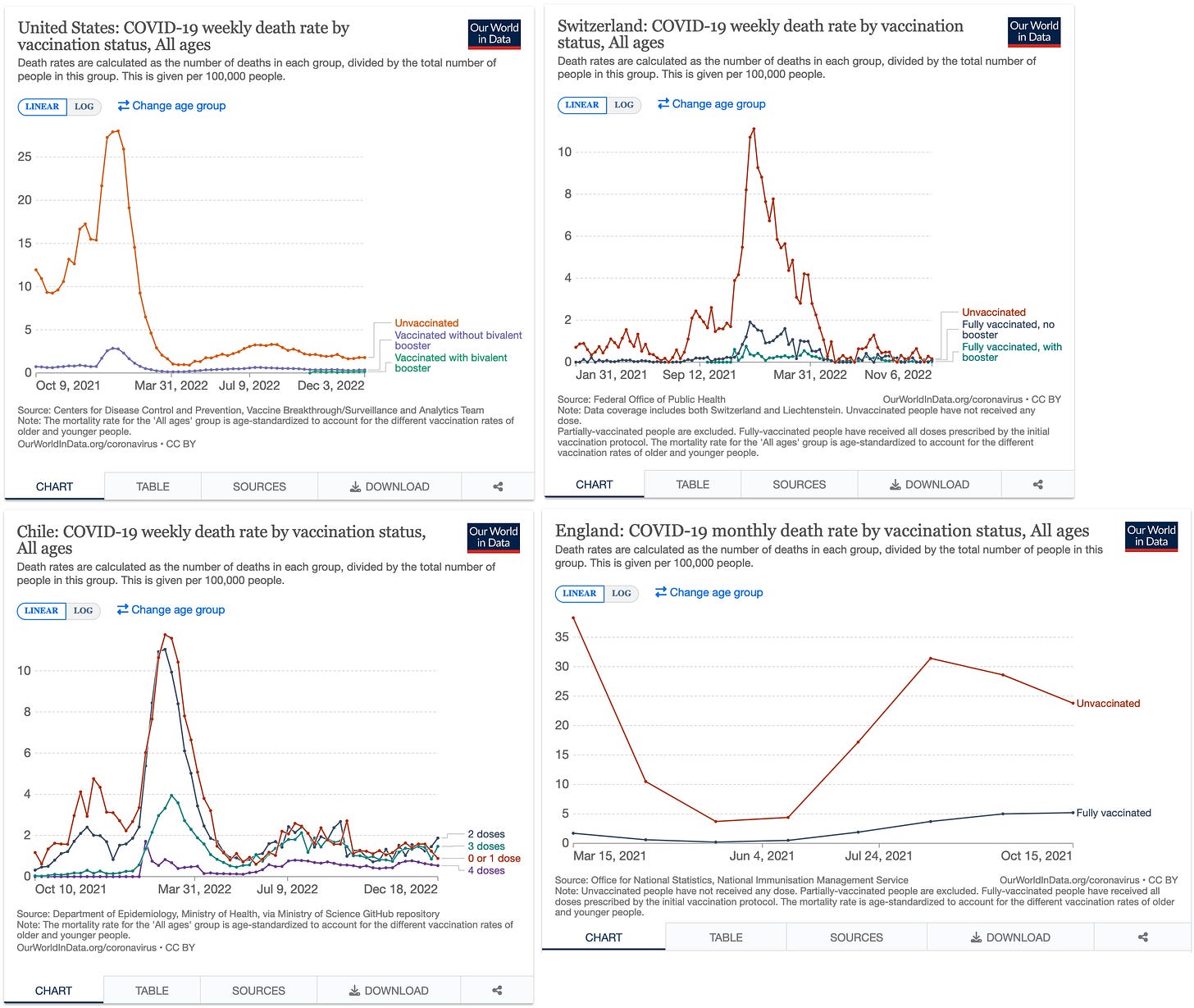
A similar chart exists for the US. Here, OWID directly links to the CDC dataset of Rates of COVID-19 Cases or Deaths by Age Group. This probably deserves another article, but it has been previously been pointed out on Twitter by me and others, that the underlying raw data, which is deaths by vaccination status is not available, and these rate calculations are based on a subset of data from US states. CDC appears to source the rate calculations from the individual states. My request to the Texas Chief Epidemiologist to publish the underlying data remained unanswered, as they simply stopped replying. So this means, that these simple rate calculations are not made public and kept hidden from the public. I wonder why?!

2. Inconsistencies in rates between countries
OWID provides a total of four countries for the comparison between unvaccinated and vaccinated COVID-19 rates. Have a look at the y-axis:
The absolute rate of the unvaccinated differs massively between countries, just look at the y-axis values. For example, in the US unvaccinated seem to die at a max rate of 28/100k, while in Switzerland and Chile it is only at about 11/100k, the UK even reached 36/100k. So the unvaccinated in America are dying 2.5x more often than in Switzerland? And unvaccinated Brits are dying more than three times as often as unvaccinated Swiss? This clearly points to some underlying data problems. The same problems also persist when looking at the individual age groups, in OWID’s explorer.
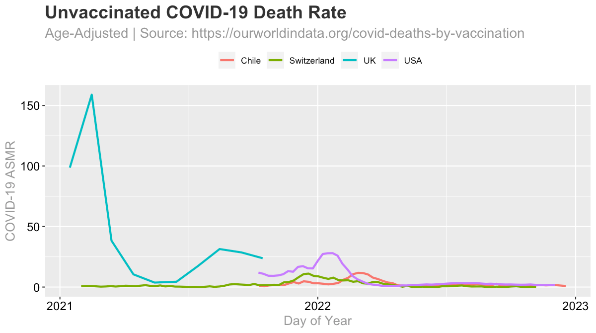
Here’s a view of all unvaccinated (Chile is 0 or 1 doses)
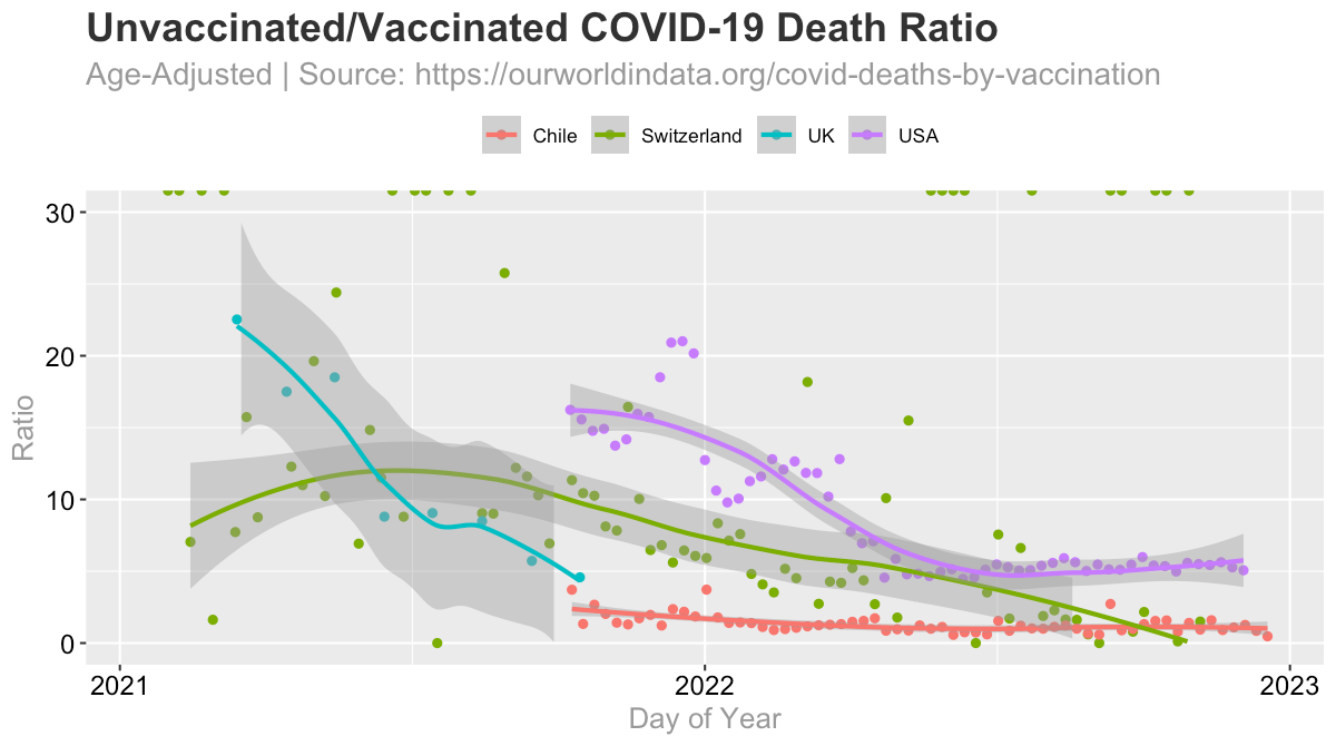
It becomes even more clear, when we calculate the ratio of the unvaccinated mortality rate divided by the vaccinated mortality rate.
It is not really explainable, that death rates differ so much between countries.
3. Data availability issues
As seen above, this kind of data only exists for the four mentioned countries.
Data for the UK is only available for a very short time frame, only 10 months, not even a full year.
The raw data for the US is not available.
Zero and one vaccine doses for Chile are ‘lumped together’.
This leaves only Switzerland, as the only country that is still updating their data, but even they changed their reporting structure in the middle of 2022.
Hence, for the following points, I am only going to focus on Switzerland, as the other countries do not have sufficient data.
4. Some columns are omitted
The Swiss dataset, actually provides the following vaccination statuses:
fully_vaccinated
partially_vaccinated
not_vaccinated
unknown
fully_vaccinated_first_booster
fully_vaccinated_no_booster
In bold, I have highlighted the statuses that OWID uses. On the Swiss API documentation homepage, it says, that status 5. & 6. are a “subdivision” of 1. - however especially in earlier weeks, these appear to be incomplete.
Unless OWID specifically takes care of that fact, which I don’t see, they ignore some vaccinated, and ontop they also ignore the partially vaccinated and unknown. At least this does not appear to change the outcome significantly.
Partially vaccinated
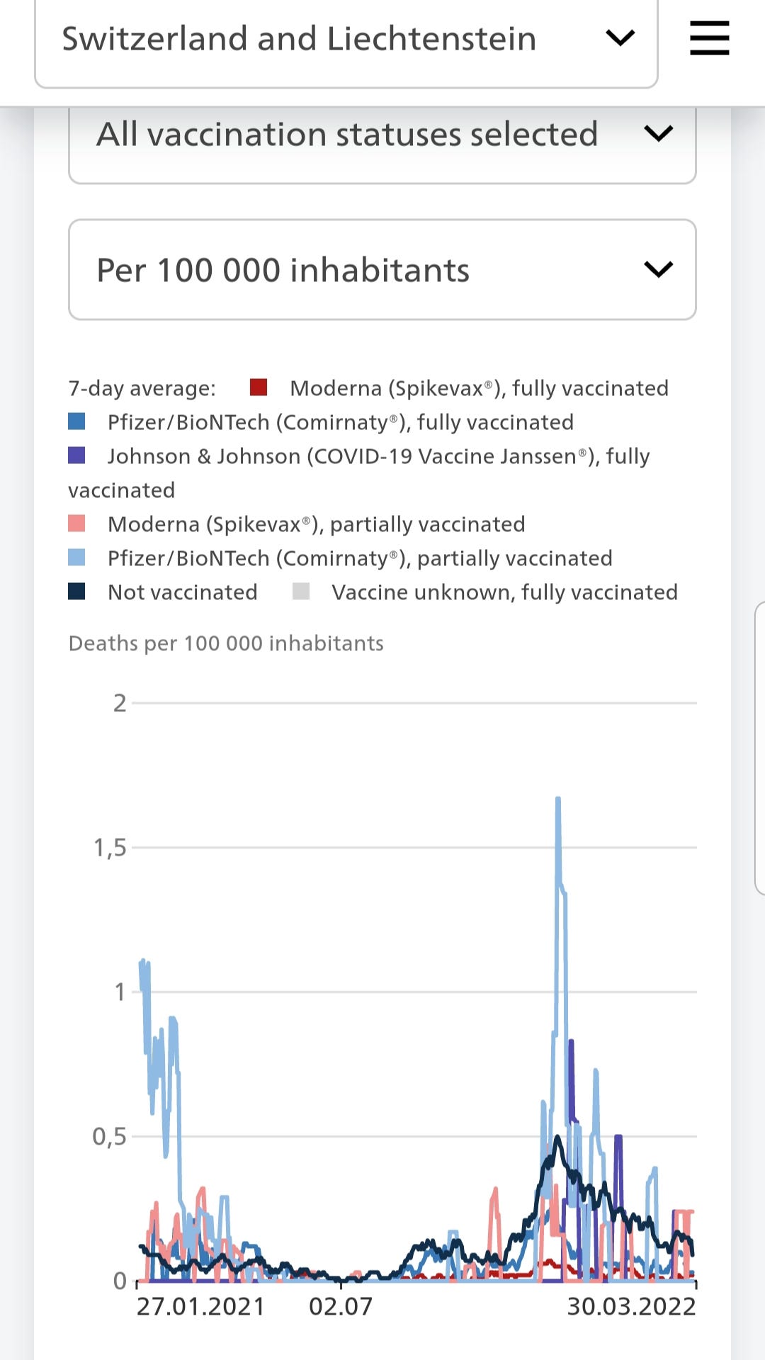
Switzerland updated their methodology once, the data got too embarrassing. The official Swiss dashboard, used to show rates for the partially vaccinated, that were higher than ‘not vaccinated’. Sometime in Mid-2022, they switched from publishing the exact doses to ‘<6m vaccinated’ and ‘>6m vaccinated’ notation. Here is the chart, they used to show on their website, clearly the light blue (partially vaccinated) had the highest mortality:
Unknown
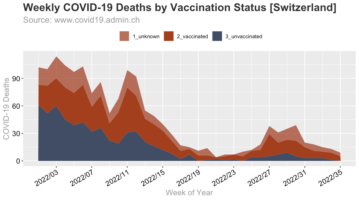
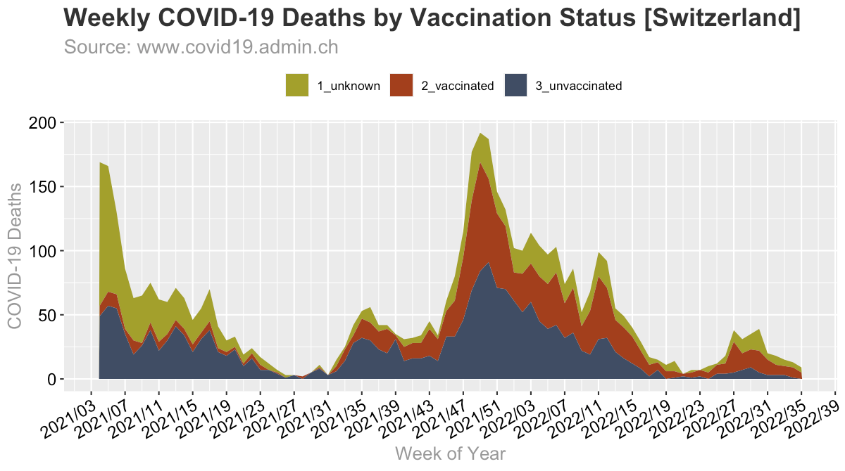
The deaths with unknown vaccination status make up a significant portion, especially in the early months of 2021.
Since we don’t know the actual status of those with “unknown” status, it would be more accurate to show the implied uncertainty in the chart. After all, it cannot be ruled out, that all the unknown deaths could be vaccinated. Hence, here I have calculated these intervals, and we can see that in some weeks, especially in the beginning, the vaccinated might have had a much higher mortality rate than the unvaccinated. Vaccinated, here, means any dose (includes ‘partially_vaccinated’).
5. A look behind the mortality rates
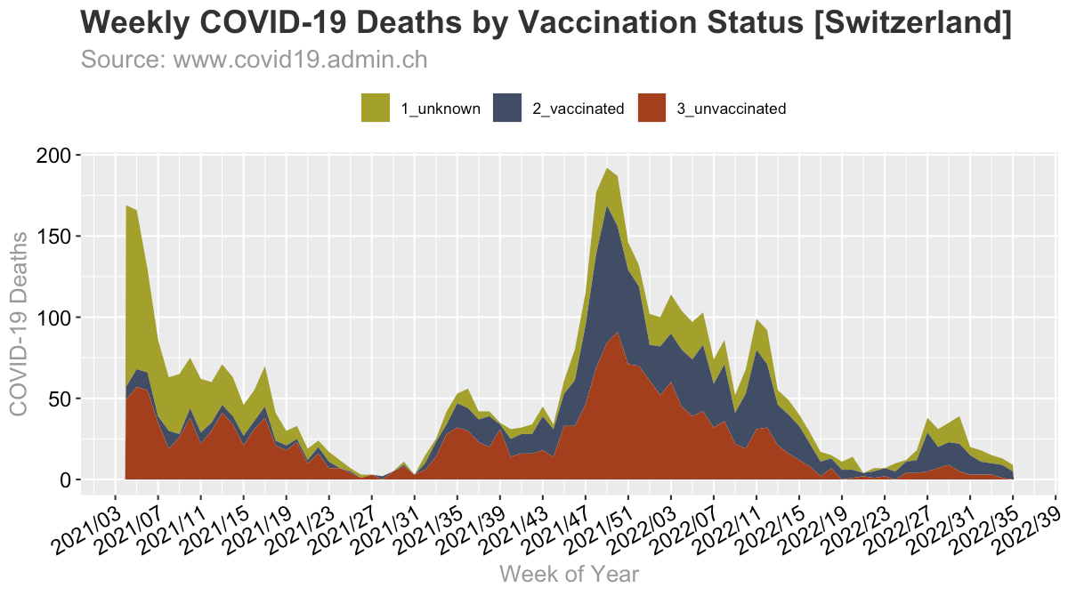
Charting the actual deaths reveals, that it’s not the unvaccinated that are dying at 10x, but it’s about 50/50. While the rate calculation is by itself the more appropriate method, a look at the absolute numbers, shows that what the rate model implies is not really true, i.e. that it would be mostly the unvaccinated that were dying. At the peak in 2021 W49 84 unvaccinated were said to have died (85 vaccinated, and 23 unknown) - while in the same week 1,749 people died, so those unvaccinated made up less than 5% of total deaths. How anyone can seriously establish a true efficacy here is mind boggling to me, as the possibilities of error are enourmous due to the relatively low numbers.
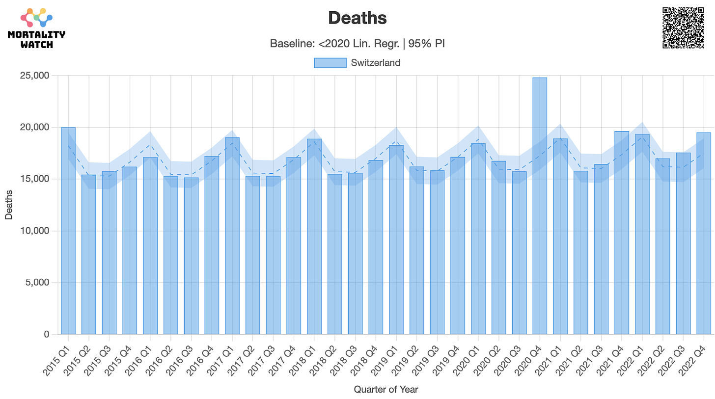
The main takeaway here, is that, these deaths are only making up a fraction of all-cause deaths, in the first place. 90%+ of people die from other causes. Also besides 2020 Q4, for which we don’t have vaccination data, none of the all-cause bars is higher than e.g. 2015 Q1, so all within normal range, nothing really abnormal in the first place.
5. Manipulative Coloring & Time Frame
As you might notice, OWID uses somewhat manipulative coloring. They chose a dark red for unvaccinated (negative perception) and dark blue (postive perception), and omitted the unknown.
Here’s how it looks if we simply switch the colors, oppositely manipulative:
Now, most of the chart above coincides with the rollout of the vaccine.
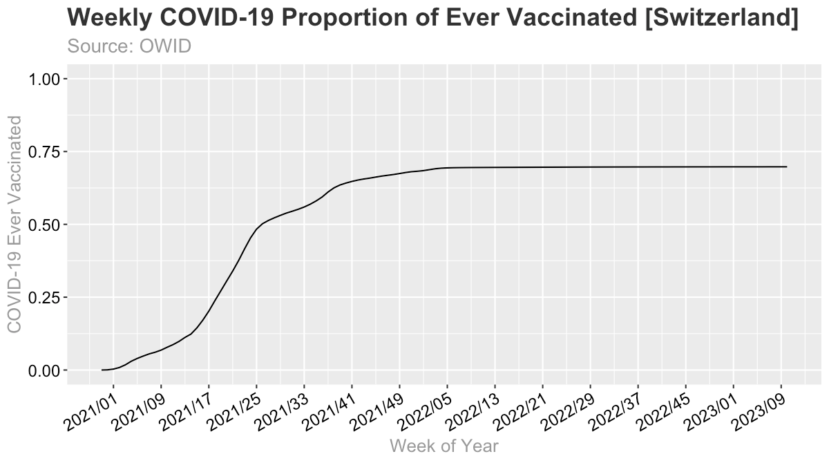
In 2021 the ever vaccinated rate rose from almost nothing to 69.8%, hence if we only look at 2022, this is how it looks like:
6. Misclassification of Vaccination Status
I don’t have information about Switzerland, but for the UK, the Office for National Statistics has recently confirmed, that vaccinated that die within 21 days are counted as unvaccinated.

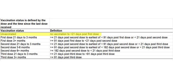
This highlights a massive problem with the PCR testing methodology. Unless it is guaranteed that both groups (unvaccinated & vaccinated) are tested with exactly the same methodology (same testing protocols, same CT values, etc.), the data will be biased and therefore misleading and in the end useless. Ontop of that there might be also differences in the underlying groups (‘healthy user bias’) which might skew the results.
The most scientific way would be to establish proper statistical representative controlled testing for incidence and hospitalizations, and randomly sampled autopsies for all cause deaths. Of course, nothing like this is done to my knowledge.
7. Considering Excess Mortality
Once we actually start looking at what matters much more than a positive PCR case, that is actual all-cause deaths and excess deaths, it gets fascinating.
For this comparison, I am using the above chart of raw deaths by vaccination status. It lists death data by vaccination status from 2021 W04 - 2022 W35.
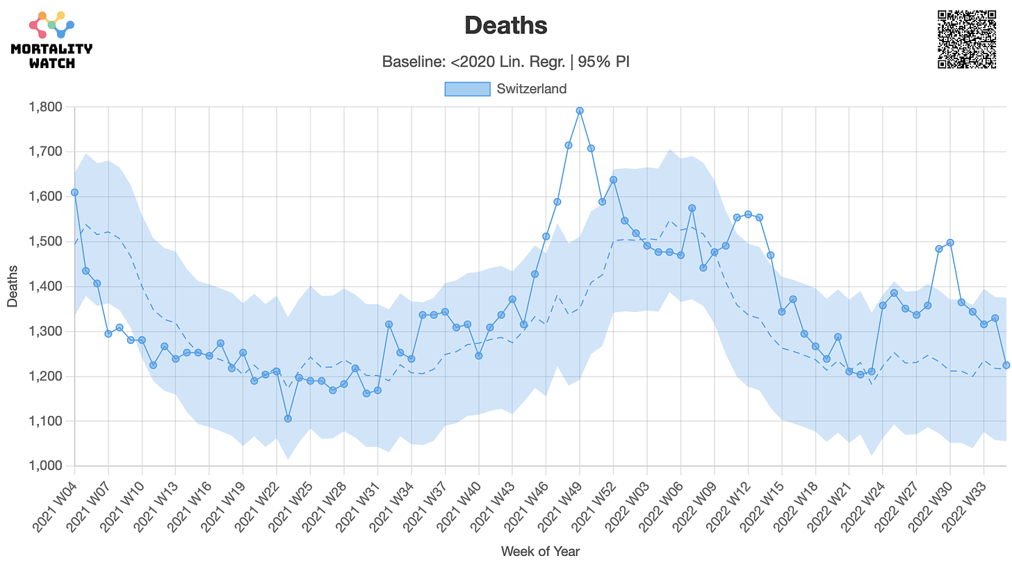
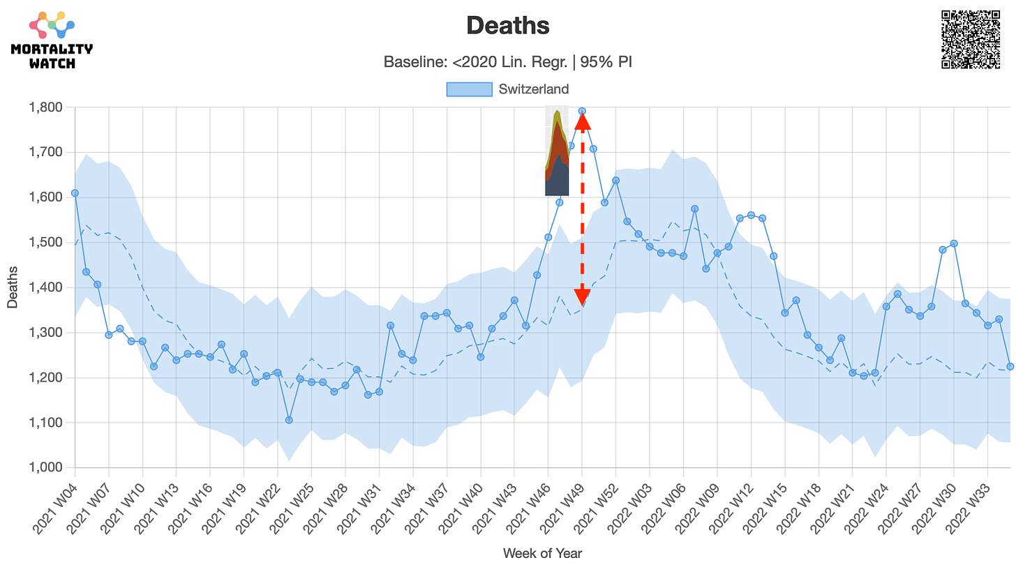
Let’s look at the same chart for all-cause mortality:
Here we can see that there are only three peaks, that leave the 95% prediction interval. The peaks roughly line up with the peaks in the COVID-19 chart, hence let’s compare them. Here are the peaks, their expected values (2013-2019 average; linear trend) and implied excess deaths compared to the reported COVID-19 death peaks, and its share of the excess deaths.
2021 W49
1,792 deaths | expected: 1,352 | excess: 440
COVID-19: 187 (42.5% of excess)
2022 W12
1,561 deaths | expected: 1,337 | excess: 224
COVID-19: 91 (40.6% of excess)
2022 W30
1,498 deaths | expected: 1,212 | excess: 286
COVID-19: 39 (13.6% of excess)
Hence, we can see that COVID-19 is making up less than half of the excess deaths in each peak. Here’s a quick example:
You can clearly see, that if we were to add these other excess deaths into the vaccinated column, how this would completely blow up the vaccine efficacy calculation. This simply shows, that unless the testing method is guaranteed and can be absolutely trusted these numbers are likely not reflecting the truth.
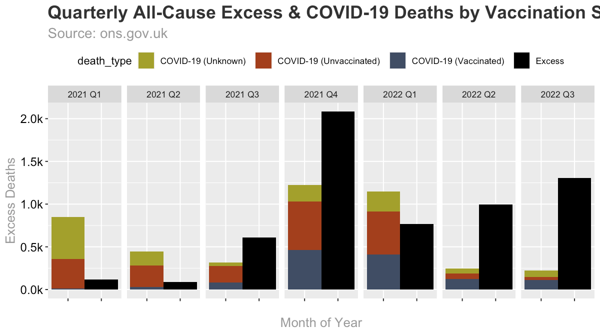
The cumulative quarterly view makes this even more clear. The black bars represent the all-cause excess deaths per quarter and the other bar represents COVID-19 deaths by vaccination status. Note that over time the COVID-19 bars change from essentially being overinflated to almost not relevant.
Here are a few reasons why this shift coud occur:
Vaccinated COVID-19 deaths are not counted as such (but coded with other ICD-10 codes) either via biological mechanism (i.e. the vaccine simply modulates the PCR response) or simply via human intervention (doctors bias/different testing methodology/CT value etc.)
Vaccinated COVID-19 deaths are not dying from COVID-19, but actually from other causes (vaccine side effects)
Lockdown induced disruptions are causing an overall rise in mortality.
Of course, this is not a complete list, as many other possibilities are thinkable.
Conclusion
The bottom line is, that the OWID COVID-19 death attribution chart is essentially meaningless because COVID-19 was sold to us as the main driver of excess mortality. Hence, with a working vaccine, we would expect COVID-19 and excess mortality to decrease back to normal levels. Since this is not the case, vaccine efficacy claims based on these flawed numbers are highly questionable and should be further investigated.
Data & Calculations
Data & Calculations can be found on Github.





As far as I am aware, OWID is funded by the Gates Foundation. This won't stop the zombies from believing every word, but I wouldn't trust it one bit. I can't recall the last time people responsible for mass death provided the data to incriminate themselves. Oh, that's right, never.
My aunt was 'almost' killed by 2 rounds of 'run! death is near!' but for the grace of God and prayers! She was unjabbed. So, I believe a lot of unvaccinated deaths were 'death by hospital'!