Debunked: Three Misleading Vaccine Efficacy Charts Exposed
These widely circulated charts, often promoted by vaccine advocates, have been scrutinized and found to be scientifically inaccurate and misleading.
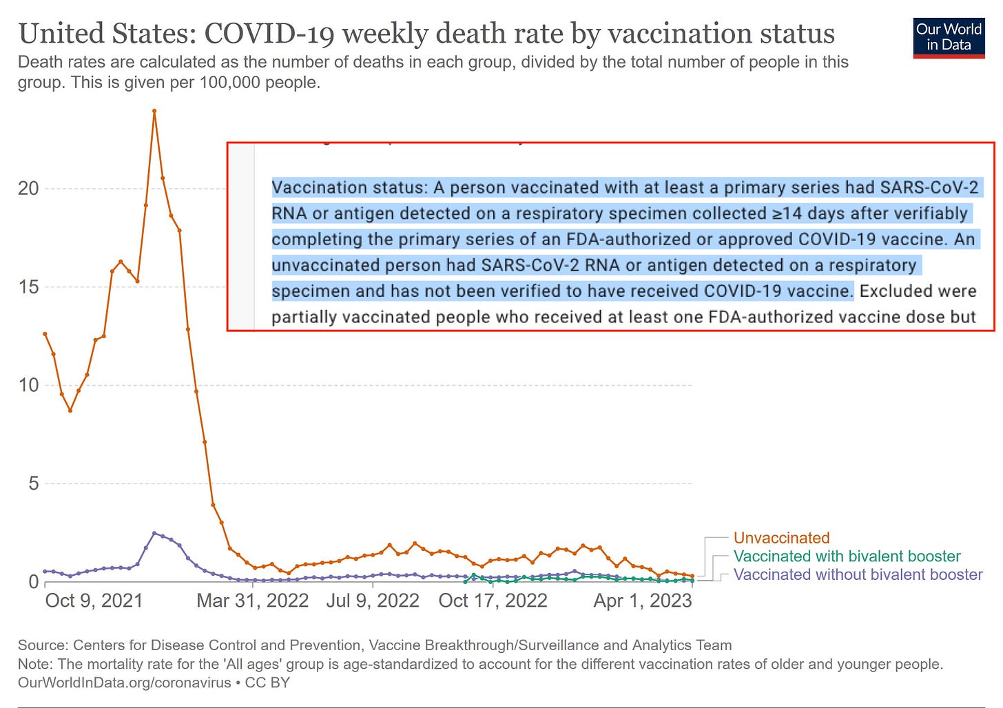
1) COVID-19 death rate by vaccination status
Below is a prime example of why reading the sources and methods sections is crucial. Without doing so, it’s easy to be misled by deceptive pharma propaganda charts like this spread by Our World in Data (OWID).
The underlying CDC dataset explicitly acknowledges that it did not track data from day one, even in cases where vaccination status could potentially be matched—though it is doubtful they were able to do so for the majority of deaths. This is primarily because the CDC lacks a comprehensive registry linking individuals to their vaccination status by name or social security number, making it challenging to accurately capture data across large segments of the population. Furthermore, it is worth noting that Our World in Data (OWID) receives funding from organizations such as the Bill & Melinda Gates Foundation and pharmaceutical companies, which raises questions about the objectivity of the narratives they promote.
So in summary, the chart contains at least three major issues:
Use of unreliable data – It relies on biased, uncontrolled & unvalidated COVID-19 testing data rather than, objective gold-standard all-cause mortality.
Exclusion of relevant data – Individuals are only considered vaccinated 14 days after their second dose, omitting at least five weeks of critical data.
Misclassification of vaccination status – The “unvaccinated” group likely includes a significant number of vaccinated individuals whose status could not be matched or verified. (In Germany, ~80% vaccination status is unknown!)
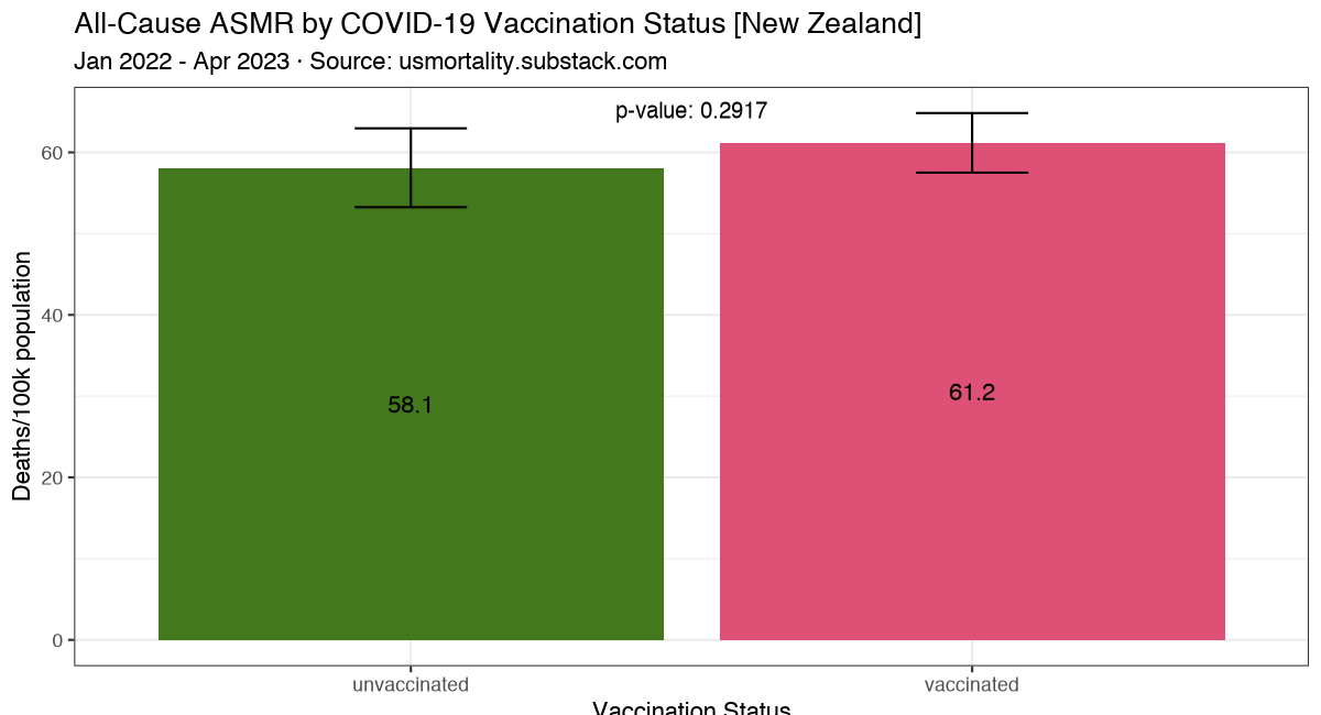
In contrast, gold-standard age-standardized all-cause mortality data obtained from Health NZ through a FOIA request shows that unvaccinated individuals did not have a higher all-cause mortality risk than vaccinated people.
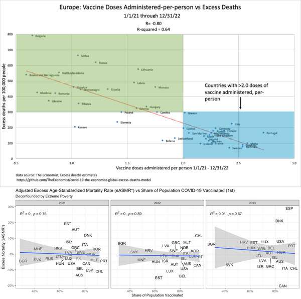
2) Correlations of Vaccine doses administered vs Excess Deaths
Top: Simple correlation of excess deaths vs vaccinations, shows a spurious correlation.
Bottom: Correctly adjusted for confounders like age and poverty, shows no (positive) vaccination effect!
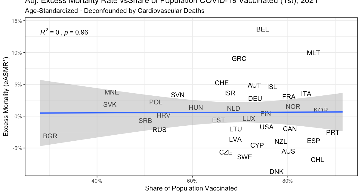
The observed correlation in 2021 is driven by confounding factors, such as extreme poverty and cardiovascular death rates, making it a spurious correlation. Once mortality rates are properly adjusted for these confounders, the correlation disappears entirely.
Read more here:
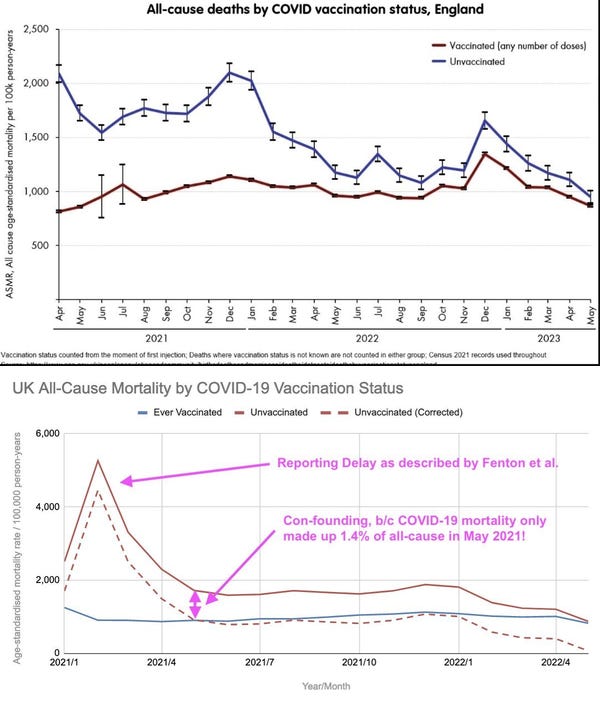
3) UK ONS All-Cause Mortality data by Vaccination Status
1. The perceived benefit of vaccination over non-vaccination can simply be explained by examining non-COVID-19 mortality or focusing on a period when COVID-19 had minimal impact—for instance, May 2021, when COVID-19 accounted for only 1.4% of all deaths. This analysis reveals that overall mortality was higher among the unvaccinated, not due to COVID-19, but as a result of other confounding factors, such as poverty, preexisting health conditions, and socioeconomic disparities.
2. Fenton & Neil highlighted that the initial spike in mortality was merely an artifact caused by delays in reporting vaccination status. In response, the ONS removed the problematic data, effectively acknowledging that their initial analysis contained flaws.
Once adjusted by the confounding effects, this spurious effect also completely disappears.
Summary
All three charts can be attributed to flawed methodologies—such as failing to match entire cohorts, not starting observations from day one, and misclassification—or to confounding factors like underlying health conditions, the impact of lockdowns and socioeconomic factors (with unvaccinated individuals often excluded), poverty, and more.
As a result, I have yet to find credible evidence that these vaccines have saved a single life. On the contrary, we already have confirmed cases of severe harm, with thousands injured or killed, even acknowledge official by governments!
Please don’t forget to like & leave a comment about your thoughts. Most importantly, if you enjoy my work & want to help, please share & consider upgrading to a paid subscription!


Covid positive PCR test is really inaccurate.
Never calibrated. A multitude of false positives caused by many different every day items
Orange juice, to Coke Cola and others.
But I suppose using their own data is the best way to show the stupidity of it all.
BEWARE the who pandemic treaty