COVID-19 Vaccine Efficacy against All-Cause Death
Vaccine Efficacy calculation based on the new ONS English All-Cause Data shows that the vaccine should probably be pulled!
Background
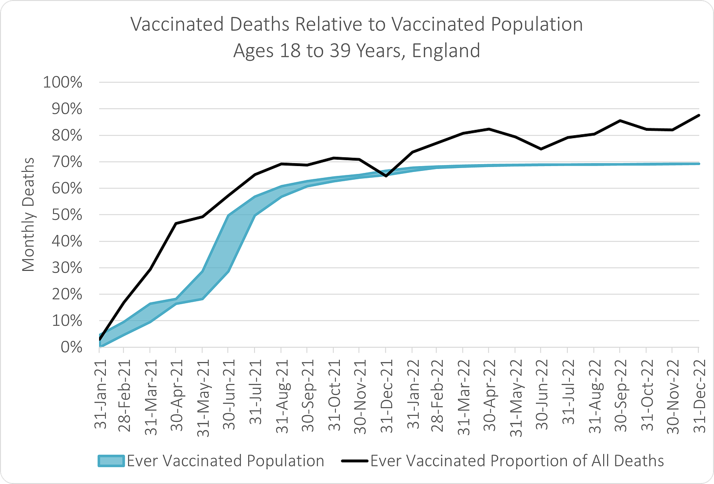
I was working the whole day on the last article, that I just published - in the meantime a Twitter friend also analyzed the latest ONS English All-Cause Data, Joel and his charts are very revealing:
The blue line shows the proportion of vaccinated people in England, while the black line, shows the proportion of deaths that received at least one vaccine. If the black line is above the blue line, that means relative to the population, more vaccinated people are dying.
I have calculated vaccine efficacy (VE) many times, before, and posted it on Twitter. Thus, I recognized, this is exactly the data we need, to calculate VE. Thankfully, Joel, also pointed me to the UK ONS dataset, for the vaccinated population.
Vaccine Efficacy
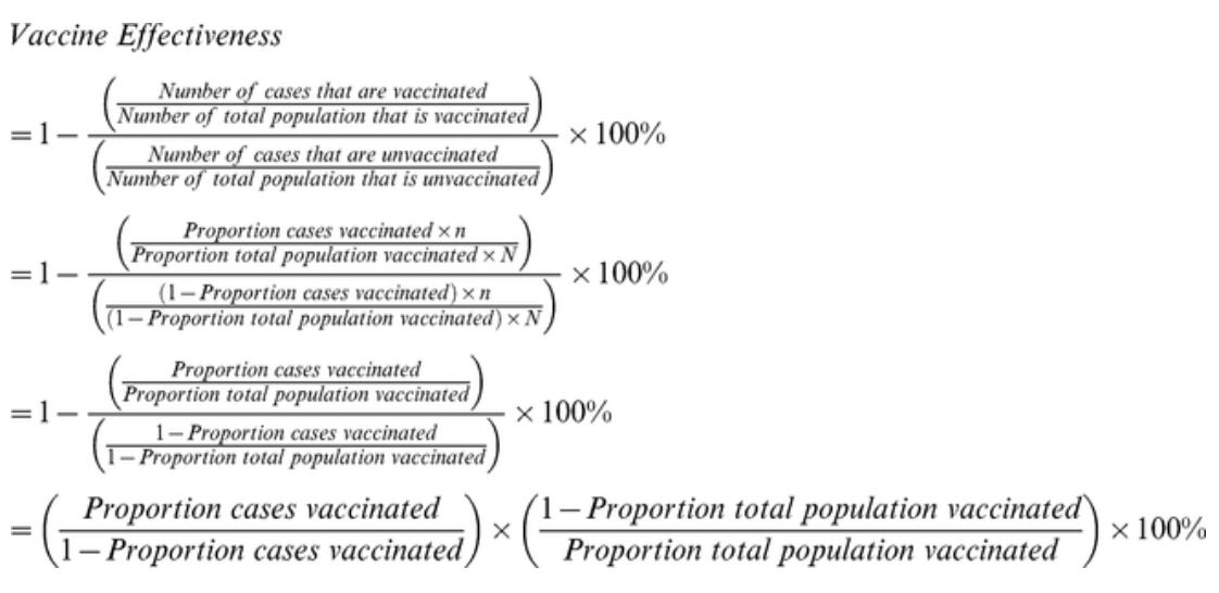
VE is commonly calculated by the Screening Method, as described by Cohen et al, 2012. Typically, a specific disease is used, but here I’m going to calculate VE against All-Cause Mortality, that means any death. So this will include other health effects from the vaccine, such as all side and long term effects! Probably the most important endpoint, because in the end it rarely matters, if someone dies from covid or a heart attack, right?
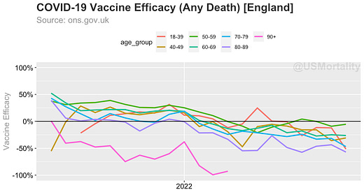
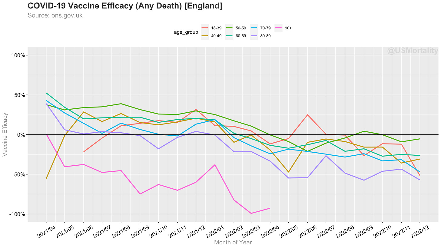
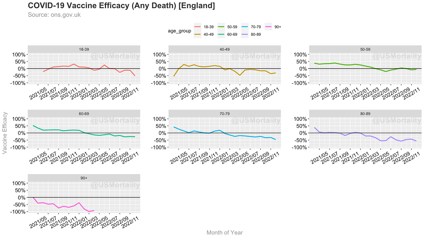
So here are the results. It shows, that efficacy was never over 50%, and went into negative territory for all age groups in 2022. That means more vaccinated people are dying in 2022 than in 2021. Interestingly the lower the age, the higher the VE - so the especially vulnerable, e.g. 80+, were never protected by the vaccine in the first place!
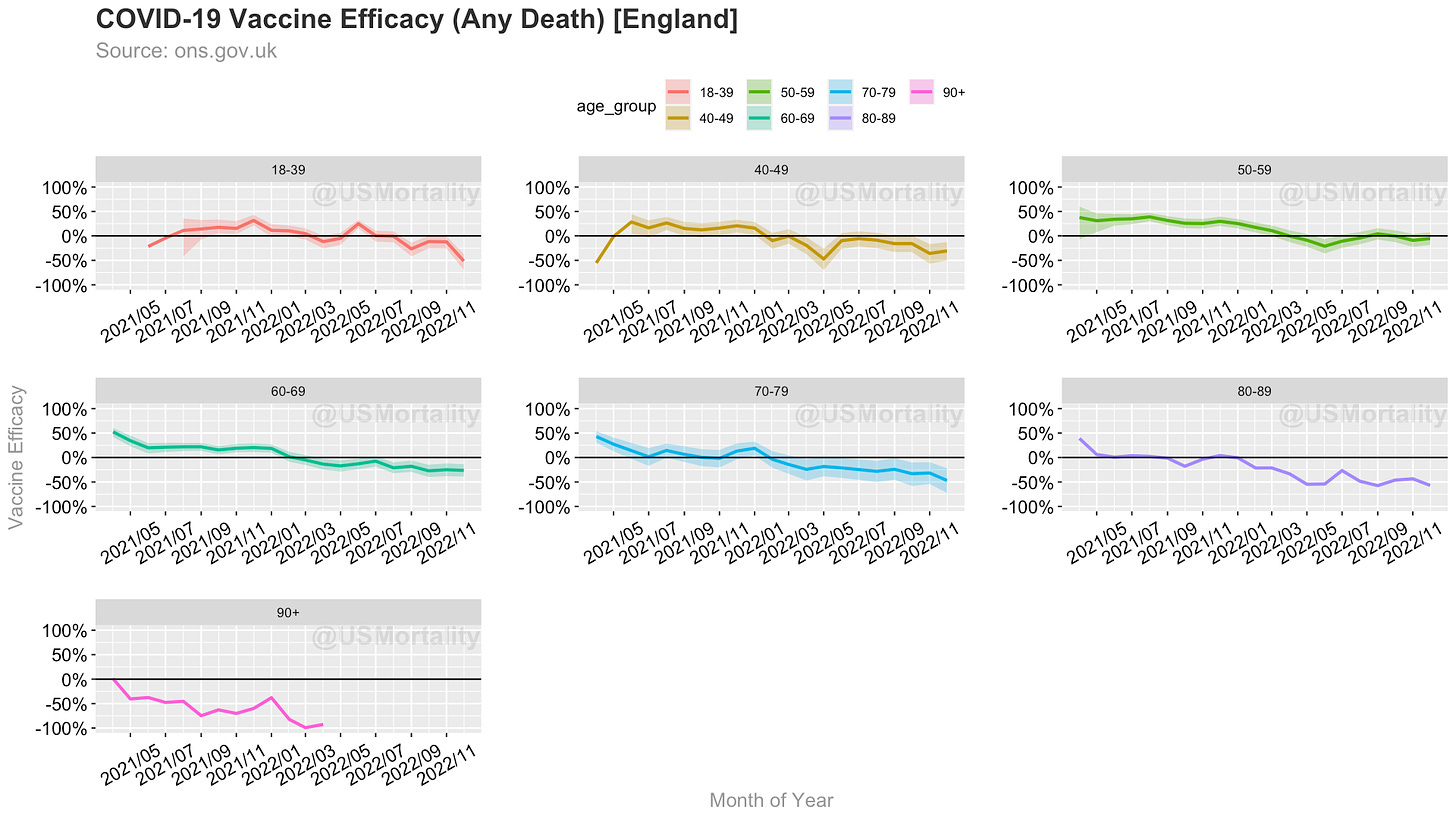
Here’s the same chart, by individual age groups:
Note: VE for age_group 90+, goes below -100%, hence the line is visually missing…
Summary
The vaccine has never significantly protected the vulnerable 70+ from death.
It appears that the vaccine leads to more deaths in 2022+.
Sources & Calculations
All calculations are done in the R language and are available open source here.
Addendum
As the vaccination rate rises through the month, we can either calculate the vaccination rate via mean, as above, or via min. Hence, I have added them as Confidence Intervals




"Interestingly the lower the age, the higher the VE - so the especially vulnerable, e.g. 80+, were never protected by the vaccine in the first place!"
I think that the myth that the jabs protected the elderly has been one of the biggest of falsehoods in the last few years. The Norwegians noted the high number of elderly who were dying in the first days/week of receiving the jab, and then advised that anyone over 80, or infirm should not get it. This was in January 2021. All other governments ignored this data and advice.
(edited as had typed January 2020).
Very good, Ben. Did you use vax rate at end of month though? Deaths data is cumulative to end of month but people die during the month. In early 2021, the vax rate rose significantly. If you use average rate for the month, how does this change things?